


The challenge
Maine Outdoor School had a logo, but they were ready for a modern, timeless and scalable update. Continuity with the old logo was a possibility, and the black bears of the original logo still had emotional resonance with staff.
Additionally, MOS wanted to emphasize Maine native, identifiable species - nothing generic.
A logo for an innovative Maine L3C helping youth develop into lifelong ecological stewards of the Maine landscape.
The opportunity
MOS’s outdoor education ethos is about looking, learning and wondering in nature, rather than big vistas and daring adventures.
This youth-centered logo could carry forward the beloved bears, which carried brand equity, while also reflecting a child’s point of view - close to the ground, with friendly, simplified silhouettes and several interesting elements to look at and identify.
The logo
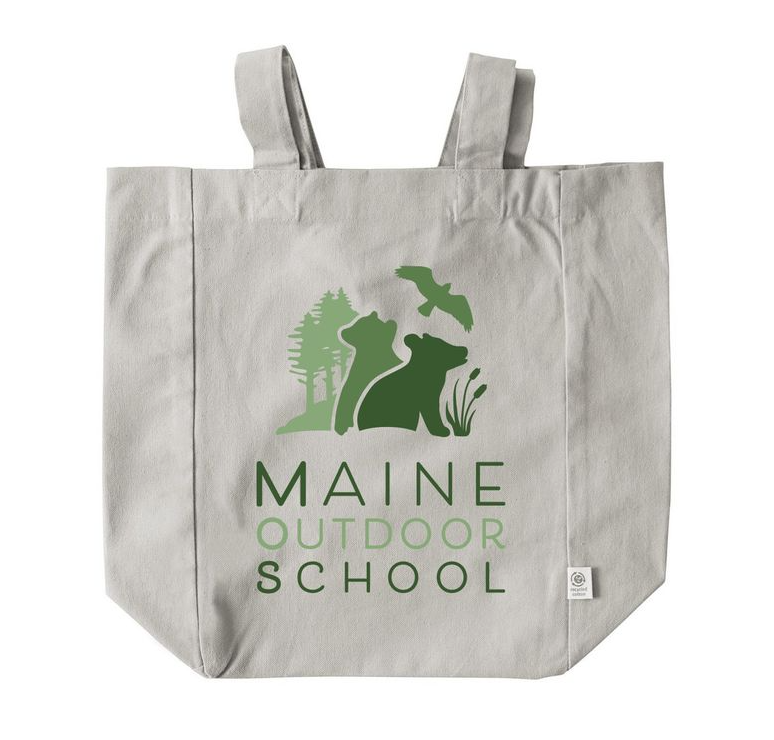
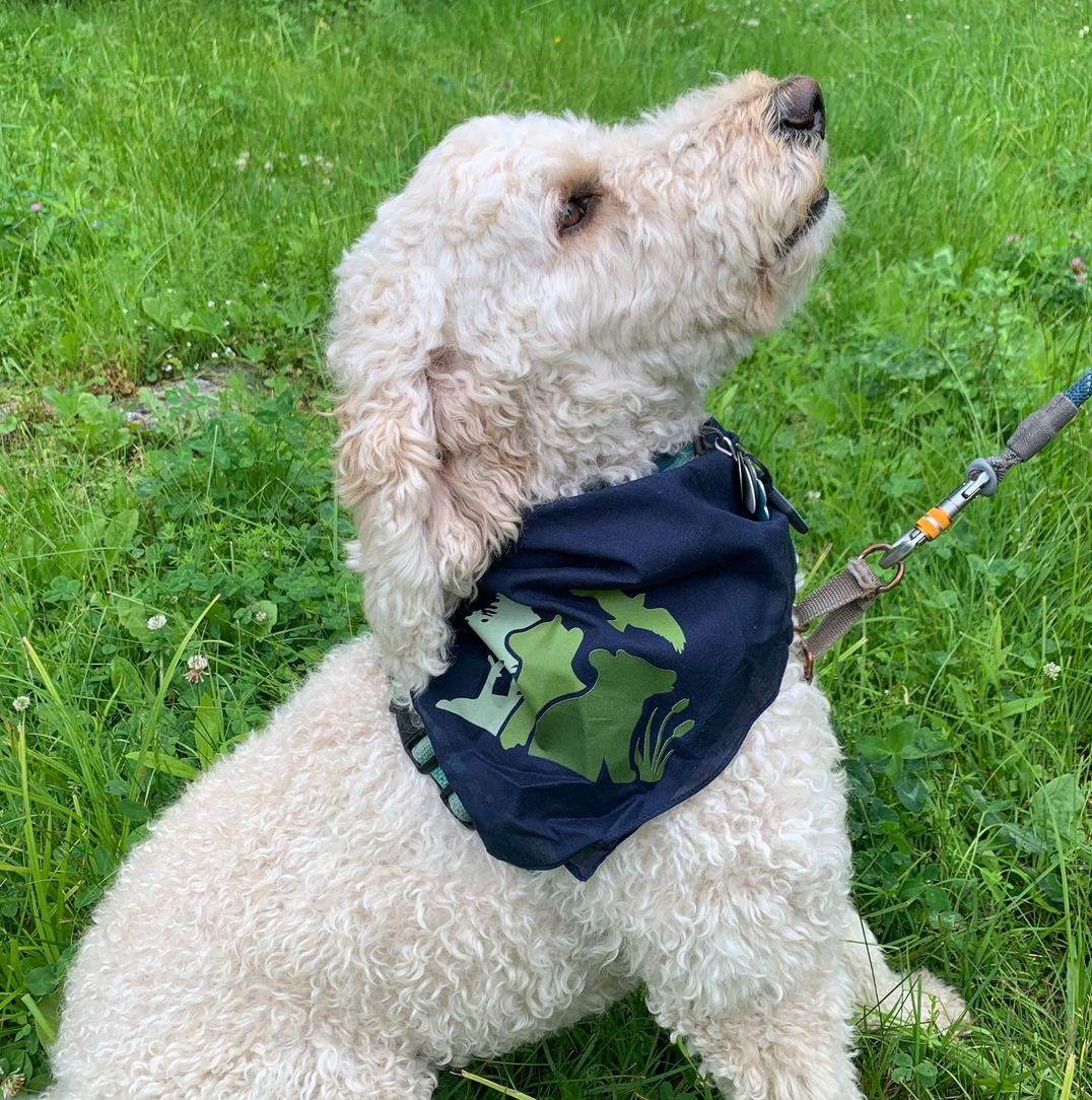
The logo stars two black bear cubs fascinated with the environment around them - an osprey overhead, great white pine in the background, and a stand of cattails nearby!
A calm gradation of four shades of green keeps the logo simple and earthy. The scene features four identifiable native species.
When is it time to update your logo?
Often, a logo needs refreshing when staff realize that the old logo is not something they are excited to use anymore. It may not be working well across all media, may be outdated or reflect an old vision of the business, or may have small or awkward details that get lost to the eye.
Often, the original logo represents a time at the inception of the organization, when the group was smaller and more “DIY” in nature. Now, the mature organization wants a professional, scalable, cross-media identity that they will be proud to roll out across all media and on merchandise.


Explore the brand
Rolling out a new logo and color palette across all of an organization’s media, online and offline, establishes and strengthens the organizational identity. MOS hit the ground running with their new logo and added bags, bandanas, caps and more!